Instructions
This guide is here to help you get started — whether you're new to Webflow or already familiar with how it works. You'll find everything you need to customize the template, understand how it's structured, and make it your own.
1. Getting Started
Introduction
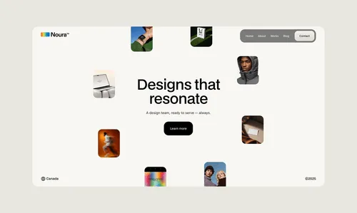
Noura is a modern Webflow template designed for creative agencies and independent designers.
With a clean layout and soft beige background, it lets your work shine through vibrant visuals, colorful mockups, and striking presentations. Noura includes 7 ready-to-use pages — from work to blog — making it easy to showcase your work.
Webflow basics
If you're new to Webflow, we recommend watching the Getting Started with Webflow course on Webflow University. It covers the essential tools and concepts you'll need to confidently use and customize this template.

How to duplicate this template
- Access the template page on the Webflow marketplace
- Click on Use for free button and create your free webflow account
- Follow the steps to duplicate the project to your workspace
Preview and testing
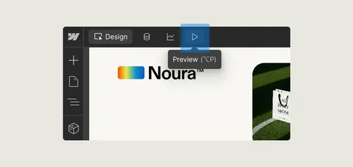
To preview your site, click the play icon in the top bar of the Designer. This will enter Preview mode, allowing you to interact with the site as if it were live — including animations, hover effects, and links — without needing to publish.
2. Structure Overview
Pages overview
This template includes 7 main pages: Home, About, Works, Work Page, Blog, Blog Post, and Contact. You can find and edit them in the Pages panel inside the Webflow Designer. Static pages like Home and About are listed at the top, while CMS templates like Work Page and Blog Post are under the CMS Collection Pages section.
Page settings
To access the settings for any page, go to the Pages panel (icon with stacked layers on the left side of the Designer), then hover over the page you want to edit. Click the gear icon (⚙️) that appears next to the page name.
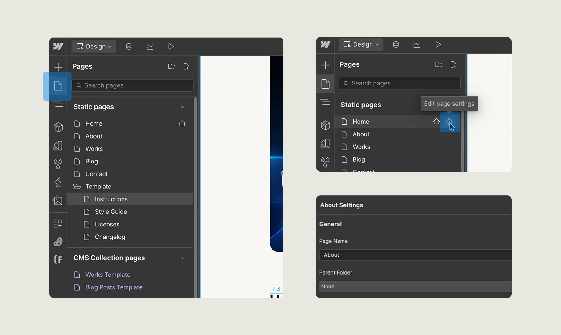
This will open the Page Settings, where you can:
- Rename the page
- Set the URL slug
- Add SEO title and description
Choosing the pages
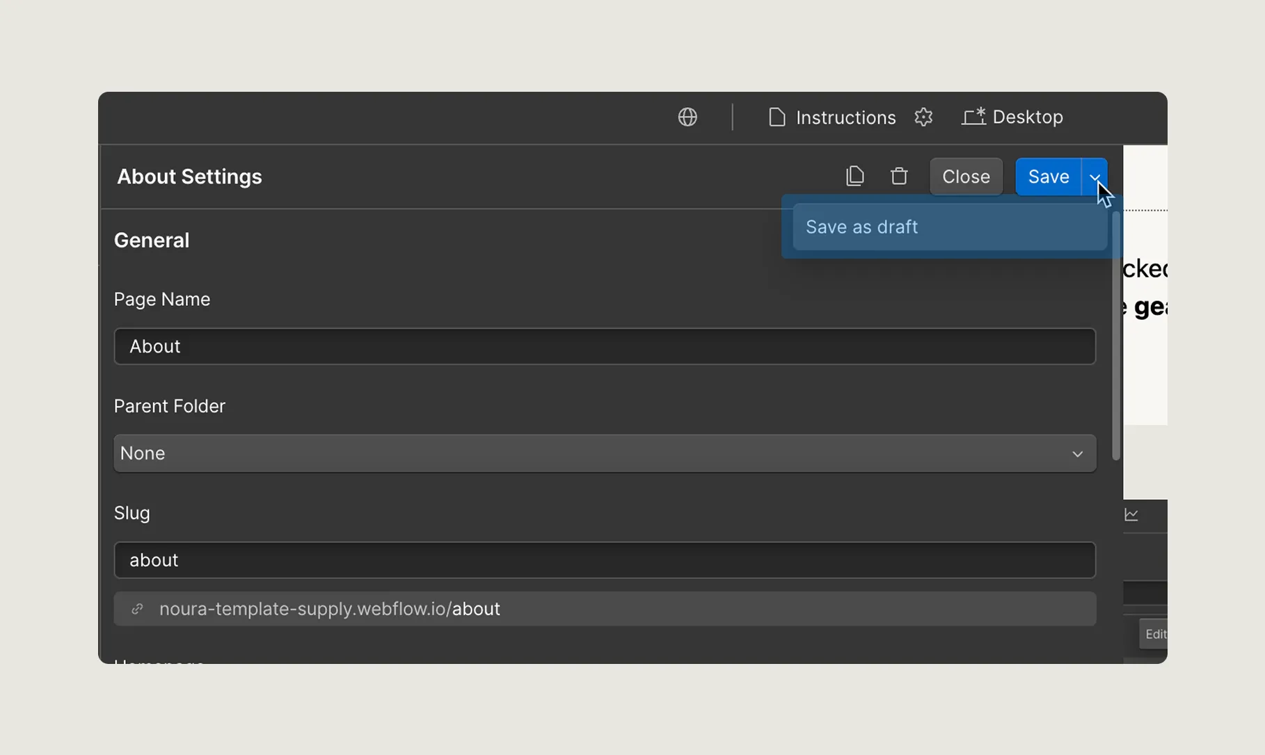
If there are pages in the template that you don’t plan to use right now, you can set them as drafts. Draft pages won’t be published to your live site, but you can still access and edit them inside the Webflow Designer. This is useful for keeping things organized while you build your site. You can set a page as draft on its page settings by clicking the arrow next to the save button.
Favicon and email notifications
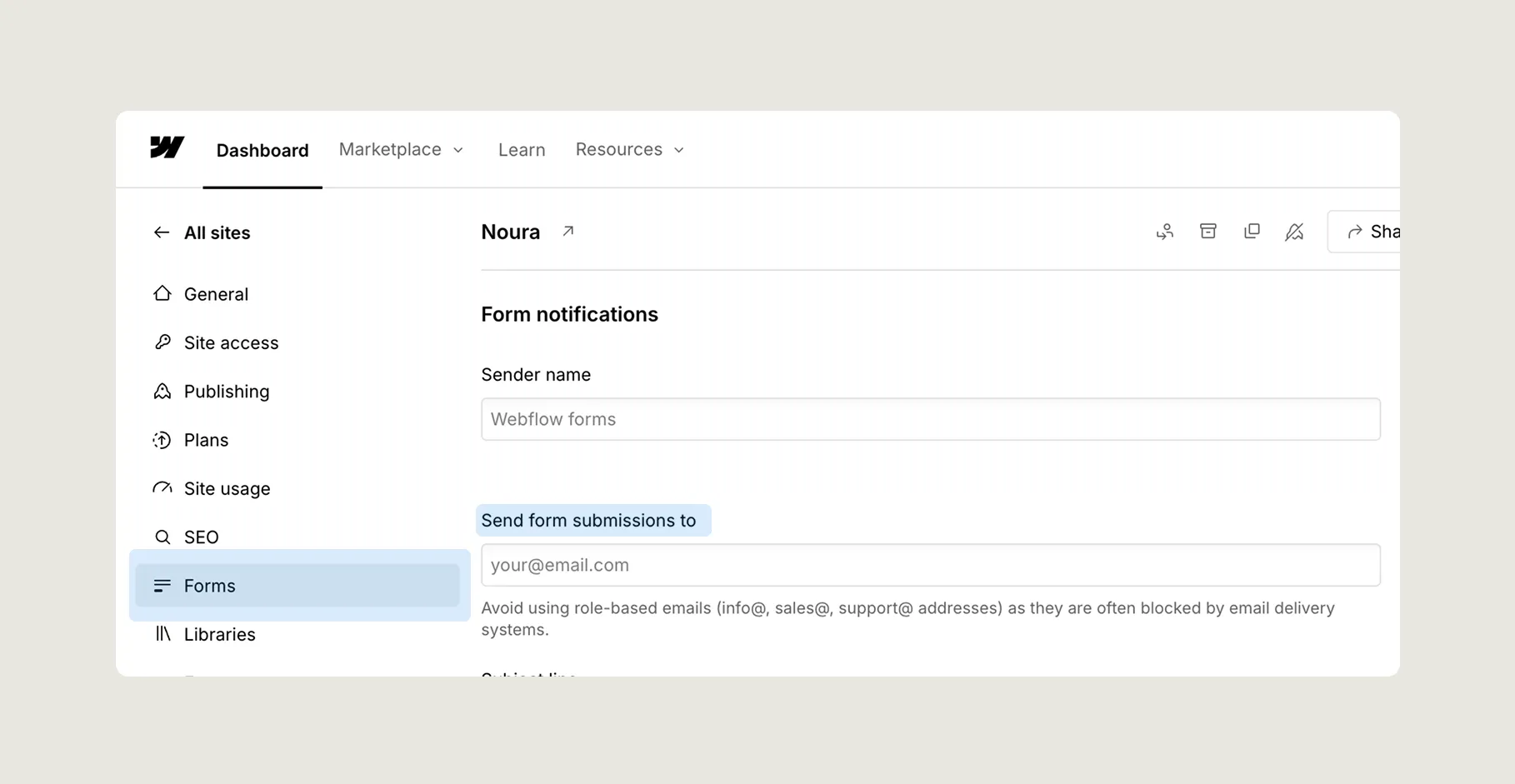
To change the favicon, email for getting form submissions, and other global settings, go to Site Settings from your Webflow dashboard or inside the project screen. There you can also manage custom domains, SEO settings, and backups. These settings apply to the entire project, not just individual pages.
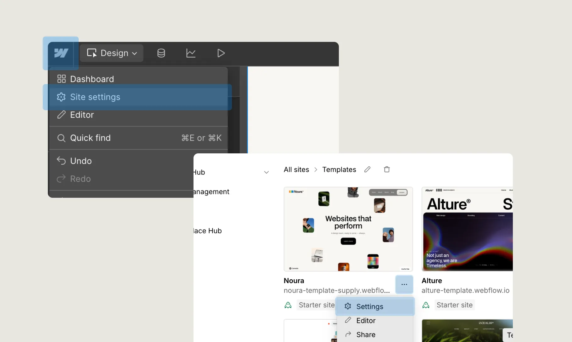
3. Updating the content
Navigator
To see and manage all the elements on a page, use the Navigator panel — it’s the icon with stacked layers on the left side of the Webflow Designer. The Navigator shows the full structure of your page in a hierarchy (like folders). This is especially helpful when:
- You can’t click an element directly on the canvas (e.g., if it's behind something or too small)
- You want to understand how sections and elements are grouped
- You need to quickly find and select a specific component, image, or text block
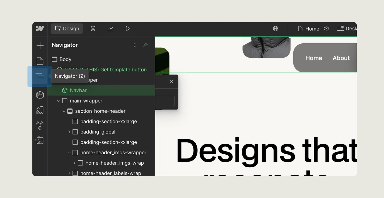
Just scroll through the Navigator, find the element you want, and click on it — it will be selected on the canvas automatically.
Components
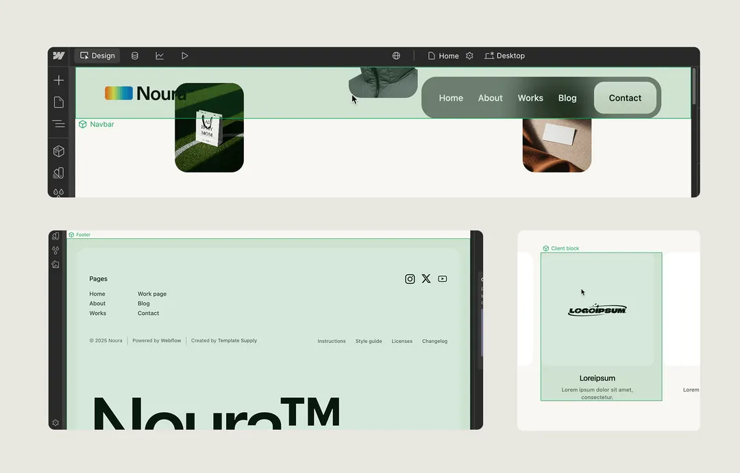
Components are reusable elements in Webflow that let you maintain consistency across multiple pages. When you update a component, the changes automatically apply wherever it’s used. In this template, elements like the navbar, footer, and other repeated sections are built as components. You can recognize a component by the green outline that appears when you select it in the Designer. To edit the elements of a component, you need to double-click it to make your changes.
Logo
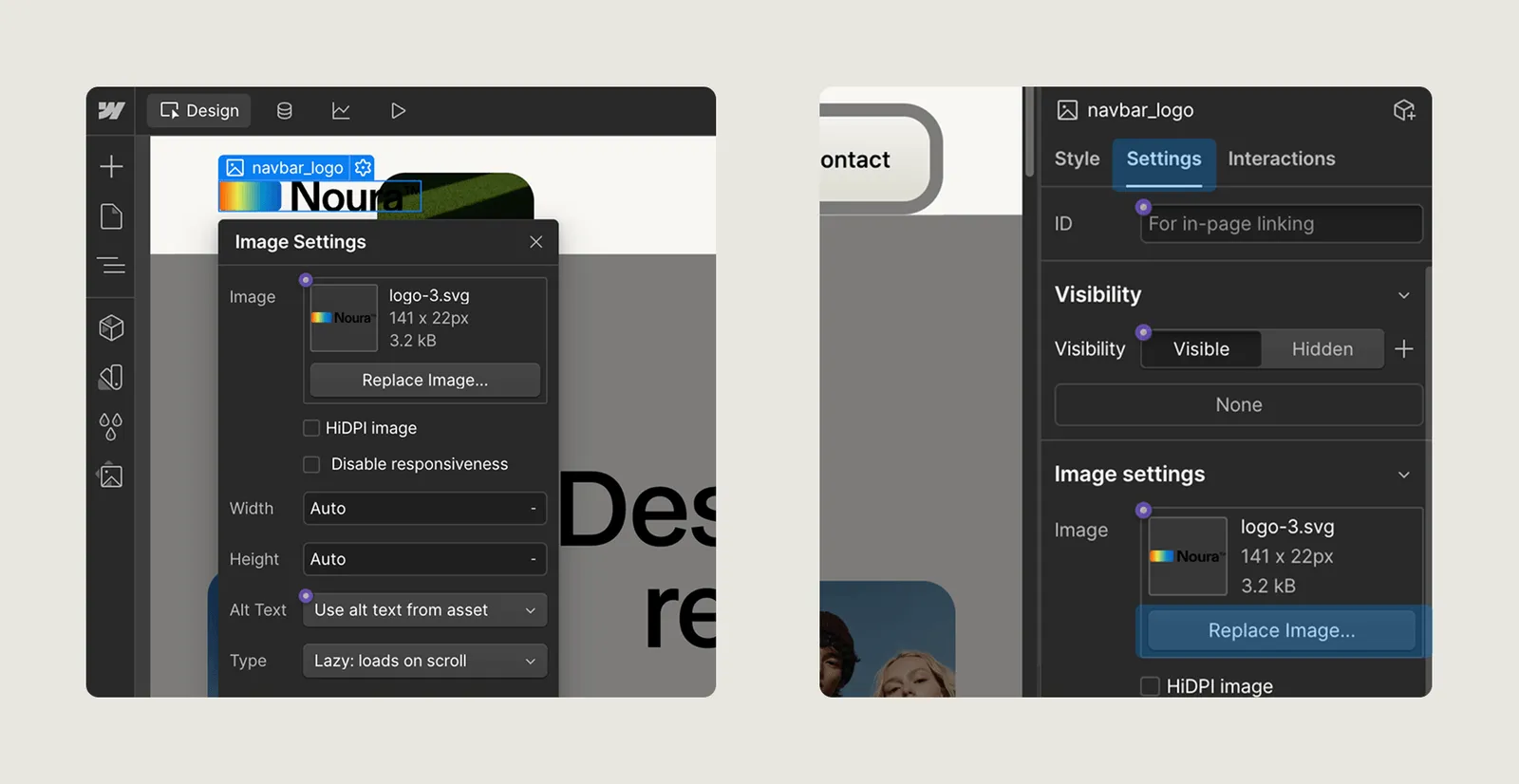
To update the logo, double-click the Navbar component to open it for editing. Once inside, you can double-click the logo image to select a new one. Or you can just click once on the logo and use the right panel to upload your own logo file. For best results, use an optimized SVG or PNG with a transparent background.
Images
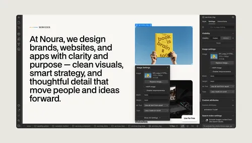
To update an image, simply click or double-click on it in the Designer. Then, go to the right panel and click Replace Image to upload a new file or select one from your Asset panel.
Texts
To update headings and text in Webflow, double-click on the text element in the Designer to enter edit mode. Once you’re in, you can type to replace the content. This works for all text elements like Headings, Paragraphs, and Rich Text blocks. Just make sure you're selecting the text itself, not the container around it.
Having trouble to select the text element or some image? Use the navigator for that.
Links
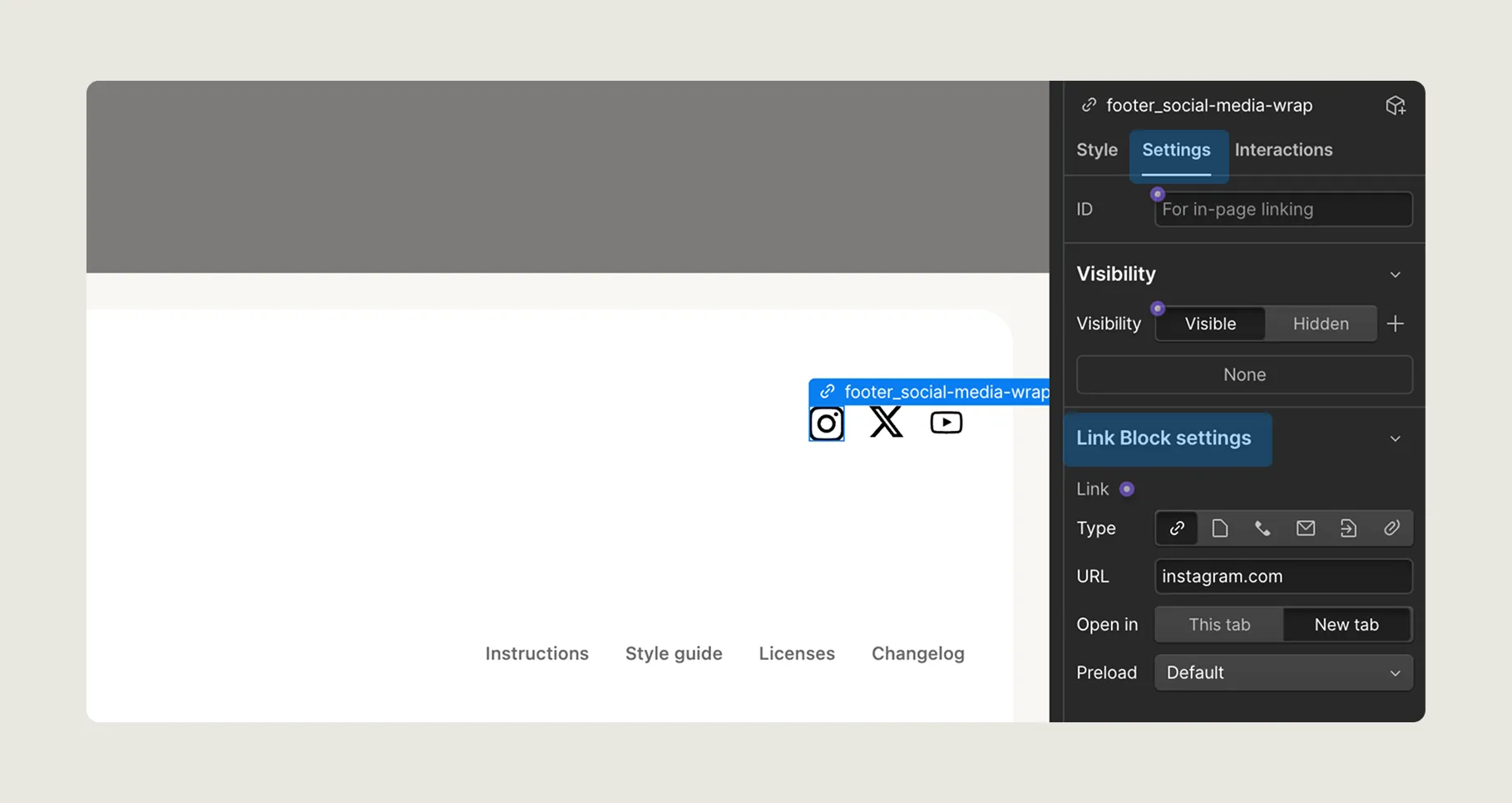
To update a link, click on the link element (such as a button, text link, or image link) to select it, then go to the Settings panel (⚙️ icon on the right). In the Link Settings, you can set the destination — whether it’s another page, a section on the same page, an external URL, an email, or a phone number. You can also choose if the link should open in a new tab or connect it to a specific CMS item for dynamic content.
Homepage header headings
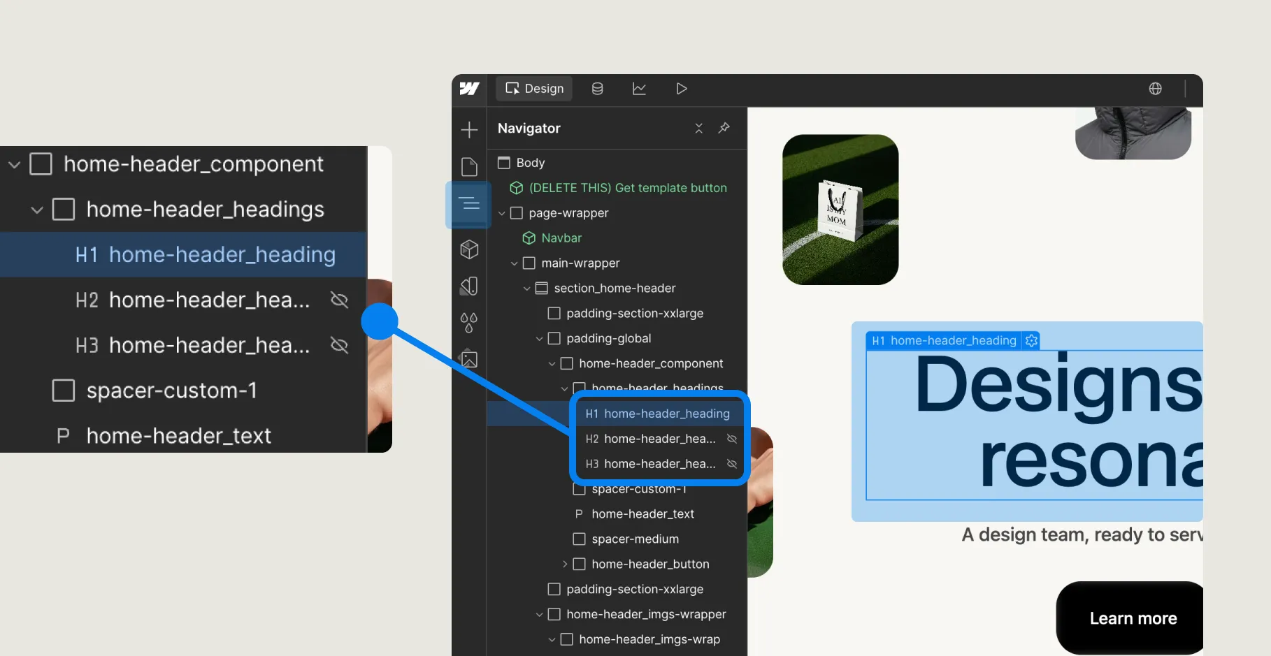
There’s an animation in the homepage header that cycles through three different headings. As you may have noticed, only the first heading is visible on the canvas. To edit the other two, you’ll need to use the Navigator panel to select them manually.
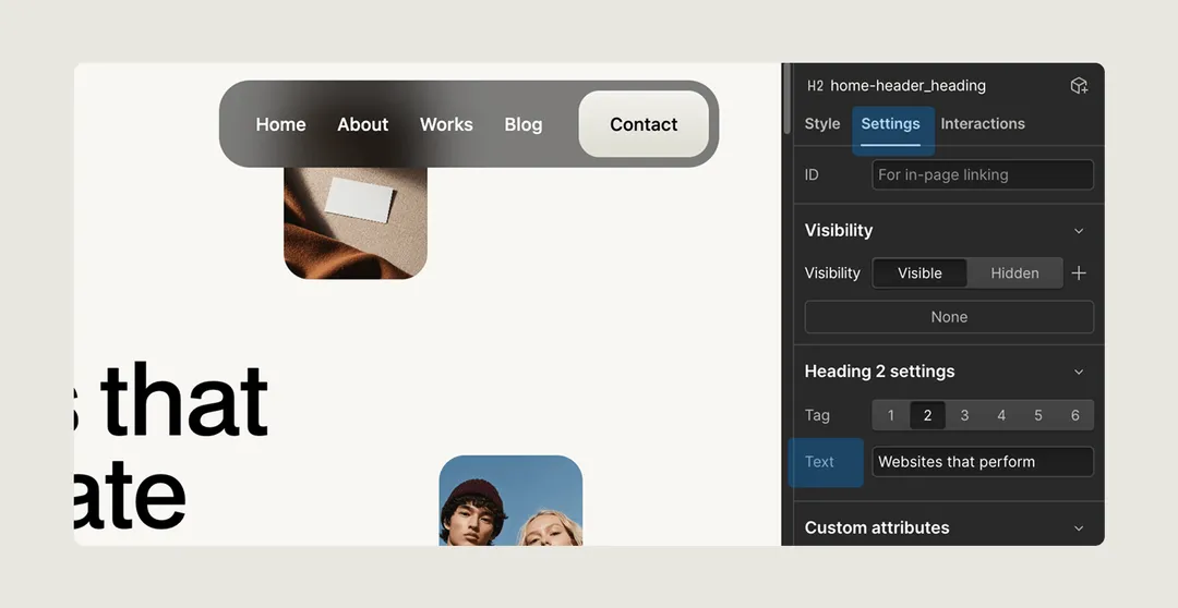
Once you select the heading you want to update, go to the Settings panel (⚙️ on the right side). There you’ll find a text field where you can edit the heading content directly.
Brand cards
On the homepage, there’s an infinite marquee showing a row of brand logos. These are inside a Component called Client Blocks. To update the brand cards:
- Double-click the Client Blocks component to open it.
- Inside, you’ll see several Client Block components, each representing a logo or brand.
- Click on the brand card you want to edit to select it.
- With the brand card selected, go to the Properties panel on the right side.
- There, you can update the logo, name, or other content directly from the fields provided.
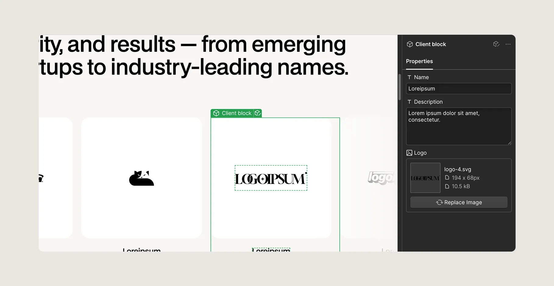
Each brand card is a separate component, so you can easily reuse or duplicate them if needed.
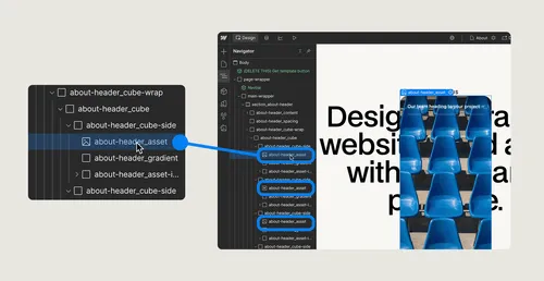
3D cube
The process to update the 3D is similar to the Headings swap on Homepage header. Since we can't select the images/video from the 3D rotating cube, we need to use the Navigator to do it. Then, after selecting, click on the settings tab and update it.
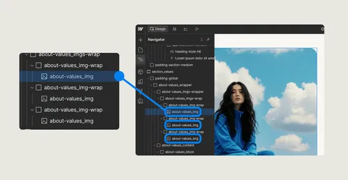
Scroll images
Just like the 3D cube, we need to use the Navigator to select the images. After selecting them, we can use the Settings tab to replace the images.
4. CMS content
This template includes CMS Collections for managing dynamic content: one for Works and another for Blog Posts. CMS (Content Management System) allows you to create and manage multiple items using a single design layout. Instead of duplicating pages manually, you can add content in the CMS panel, and Webflow will automatically generate pages for each work or blog post using the corresponding Collection Page template. This makes it easy to keep your portfolio and blog updated without touching the layout
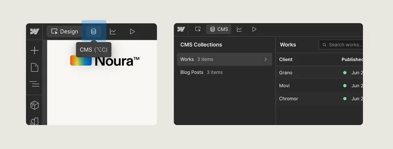
How to update works and blog posts
You can access the CMS panel by clicking the database icon on the left side of the top bar in the Designer. Once opened, you’ll see a list of all CMS collections — including Works and Blog Posts — along with their items. From this screen, you can add, edit, delete, or archive items. This is where you’ll manage all content related to your portfolio and blog without needing to touch the page layout.
5. Forms
This website includes two forms: Newsletter and Contact. When a user submits a form, the responses are sent to the email address configured in your Site Settings. To change or add email addresses that receive form notifications, go to your Site Settings and open the Forms tab. There, you can manage the notification settings for each form on your site.
6. Animations
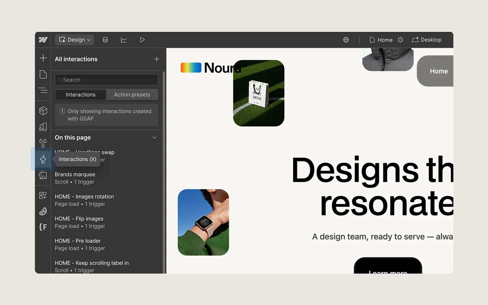
All animations in this template are powered by Webflow Interactions (IX3). You can access them by clicking the interactions icon (⚡️) on the left panel of the Designer. If you're new to Webflow, we recommend not editing the animations, as they are already set up to work smoothly with the layout. If you're a more advanced user, you'll be able to navigate and adjust them as needed to customize how certain animations behave.
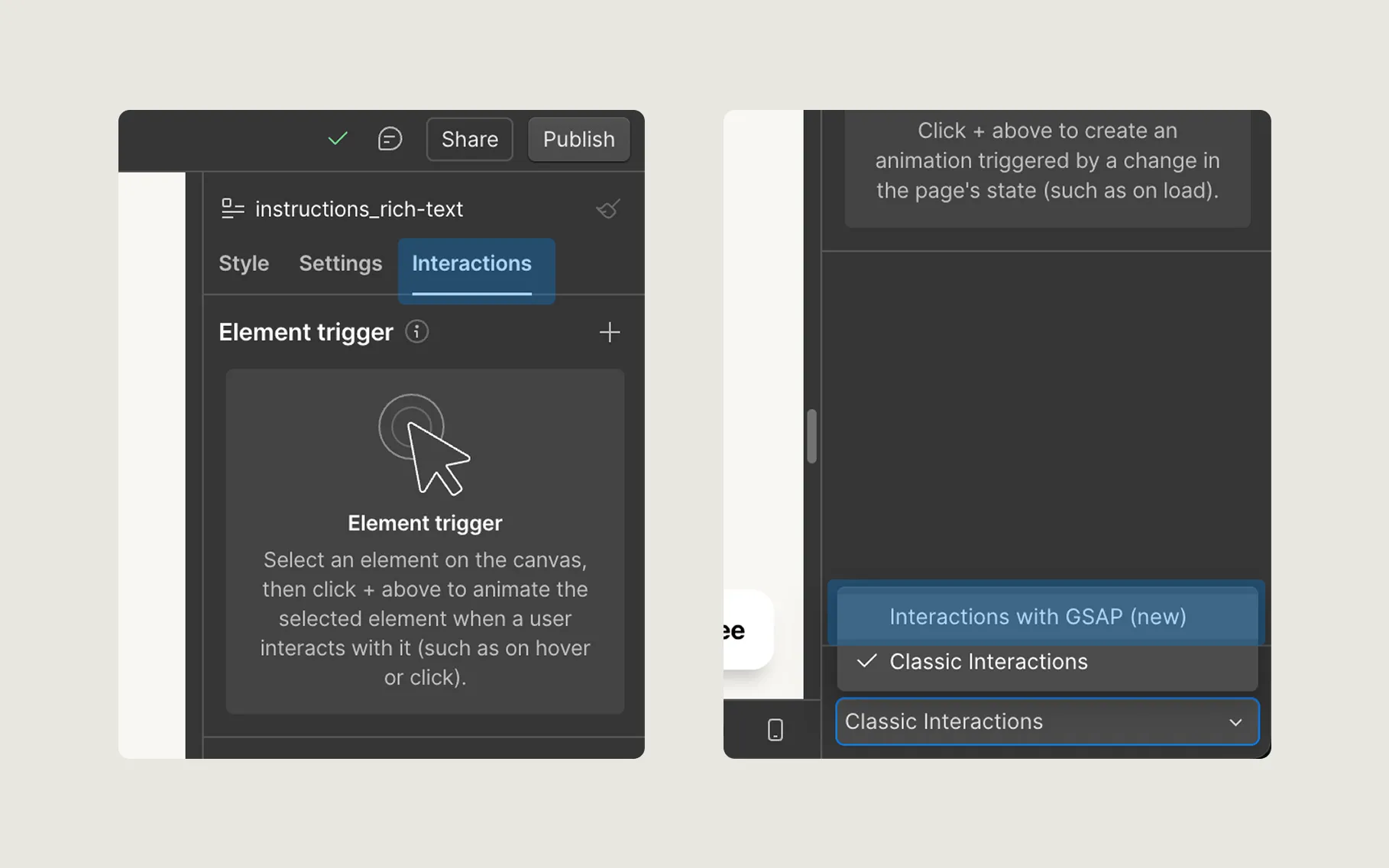
If you don’t see the interactions icon (⚡️) on the left panel, it’s likely because you still have Classic Interactions enabled instead of the newer GSAP-based Interactions (IX3). To fix this, open the Interactions tab and scroll to the bottom — there, you’ll find a toggle switch that lets you activate the new Interactions panel. Once enabled, you’ll have access to all the animations used in this template.
7. Publishing
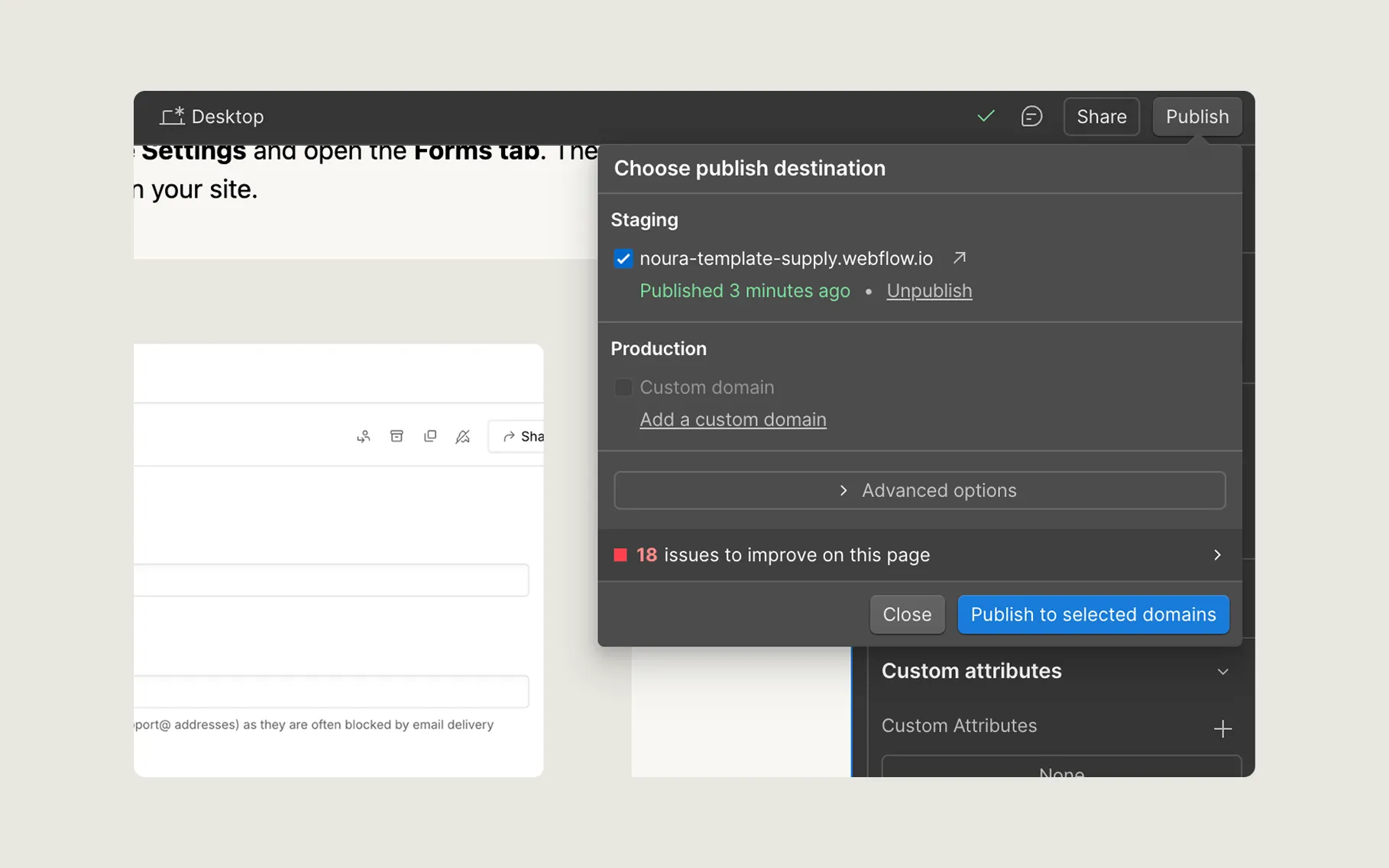
To publish your site, click the Publish button in the top-right corner of the Designer. You can choose to publish to the Webflow staging domain or to a connected custom domain. If you're using a custom domain, make sure it's properly set up by following this guide from Webflow.
Support
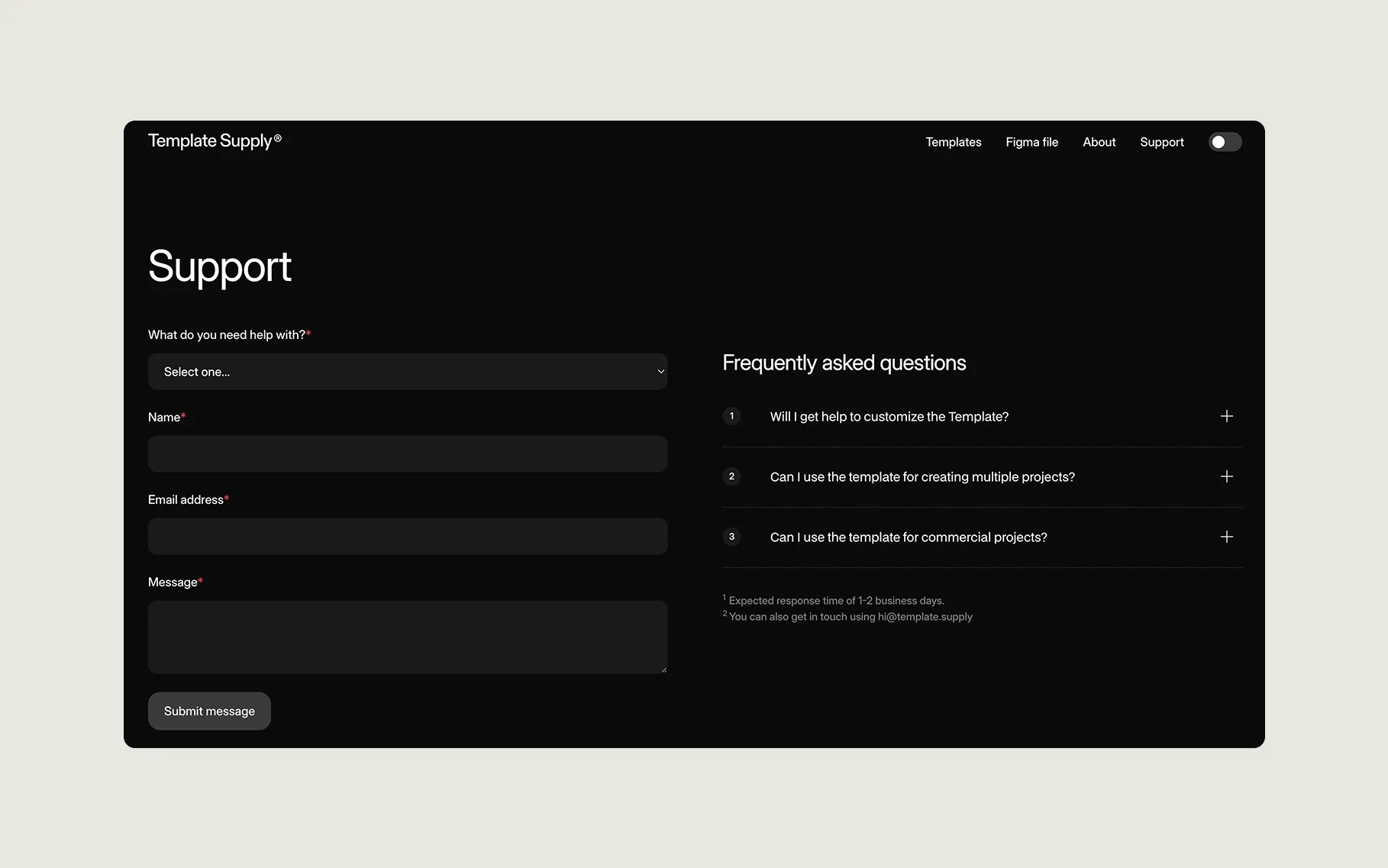
If you run into any issues or have questions while customizing the template, feel free to reach out. We are here to help! Just send a message through the support form on our website, and we’ll get back to you as soon as possible.
More templates
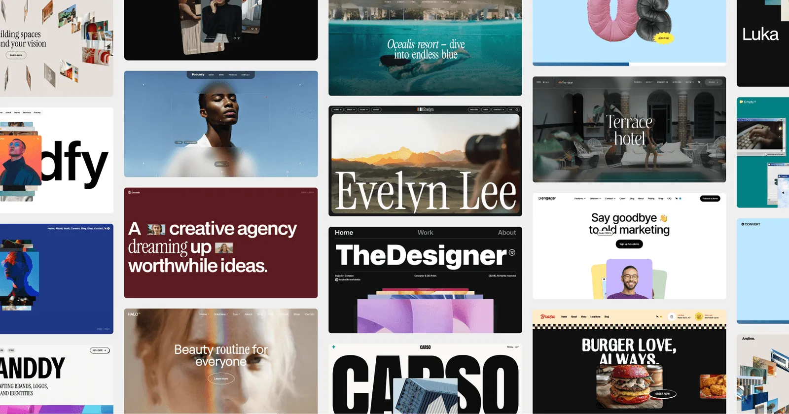
Looking for more? We offer a growing collection of Webflow templates designed to help you launch faster, look better, and sell more. Whether you're building for yourself or a client, we got you covered. Check our website and discover the right template for your next project.
aaa